
When I was handed the reins of The Oxford Club’s only value-focused editorial column back in 2024, I felt both excitement and a real sense of responsibility.
People who write about markets face a constant temptation: to make investing sound simpler than it is.
I never wanted The Value Meter to do that.
My goal was to make disciplined stock analysis easy to follow without watering it down. I wanted readers to see how a sober investor works through a stock, not just be handed another opinion.
Now, 2 1/2 years later, the column is still going strong.
Each week, we take a stock story and check it against the numbers, with the Value Meter system assigning it a score from 0 to 10 and a rating from “Extremely Undervalued” to “Extremely Overvalued.” It gives us a consistent way to ask one basic question: Does the stock’s price make sense given what the business has shown?
This method has served us well, but I’ve never believed a system should stand still just because it has worked before.
That’s why I kept testing it… and improving it.
Today, I’m pleased to share that The Value Meter will be using an updated model.
The core ideas will remain the same. We’ll still look at how much investors are paying for a company’s net assets, how much free cash flow those assets have produced, and how consistent that cash flow has been.
However, we’ve made two important changes.
First, cash flow now carries more weight.
A company’s assets can look cheap on paper, but what matters more is whether the business can turn those assets into cash – and do it consistently.
Second, we’re replacing quarter-over-quarter cash flow growth with year-over-year growth.
These adjustments weren’t made casually. Before putting the updated model to work, I wanted to know whether the thinking behind it actually held up in the historical record.
So we tested it, using only the financial information investors would’ve had at the time each rating was formed.
The study reaches back to 2010. On any given test date, the system ranked more than 1,700 eligible companies.
The results were hard to ignore.
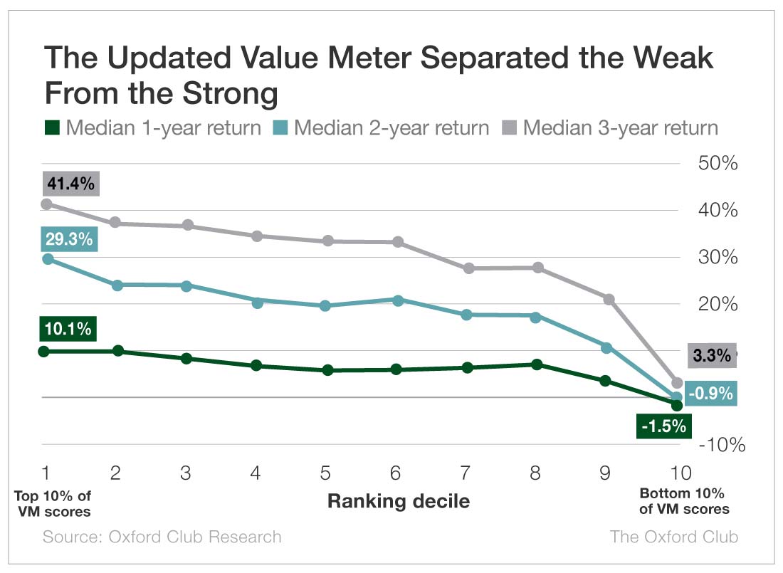
Stocks with the strongest Value Meter scores went on to post much better returns than stocks with the weakest scores.
Over one year, stocks in the top decile returned a median of 10.1%. The median stock in the bottom group lost 1.5%.
Beyond one year, the difference became even more stark. Over two years, the top group gained 29.3%, while the bottom group lost 0.9%. Over three years, the top group gained 41.4%, and the bottom group barely pushed into positive territory, rising just 3.3%.
More importantly, this was not a one-off result.
In nine out of 10 one-year tests, the highest-rated stocks beat the lowest-rated ones.
Over two years, they did it every time, and over three years, they did it in all but one test.
It wasn’t just the best stocks beating the worst, either. As Value Meter ratings got weaker, the returns generally got weaker too.
Now, this does not mean The Value Meter can predict what any one stock will do. No valuation system can.
But it does answer the question I care about most: Did the system consistently separate stronger value setups from weaker ones?
Historically, yes.
Starting next week, we’ll put the updated Value Meter to work. Yet we’ll keep testing stocks the same way we always have: taking the story investors are being sold and checking it against what the numbers actually show.
The model may have changed, but the job hasn’t.
Before we buy the story, we check the value.
What stock would you like me to run through The Value Meter next week? Post the ticker symbol(s) in the comments section below.
blackstone minerals
Nice job Anthony.
META please
TSM
NXT
Test META please
Thanks Anthony. This is helpful.
Nvo stock
Can you analyze 3M Co (MMM), please?
Look at ALNY….while it was stopped out of the Communique trading portfolio I believe it has long run momentum…
How about taking a look at PSX.
Well done Anthony! A lot of number crunching is required which probably feels like a thankless exercise until completion. The results reflect positively on your perseverance as well as providing us a better tool. Keep up the good work.
Are you willing to check AeroVironment’s value? I know it has gone up quite a bit in the last month and am curious if it still reasonable valued. Thank you.
Look at PEP please.
Bmo bank of montreal
Hi, Anthony, I look forward to reading the Value Meter column you put out every week! Can you please look at MRP, Millrose Properties? It doesn’t have a long history, so I don’t know if you can use the meter. It was spun off from Lennar in 2025, pays a nice juicy dividend. Thanks for all you do!
RATE: RITM, OBDC, OMF, DLY. Thanks!
Please look at RTX.
What would the value meter assign to a stock like ( RIO ) as in Rio tinto?
Extra Space Storage EXR might be a good choice